
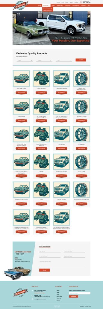

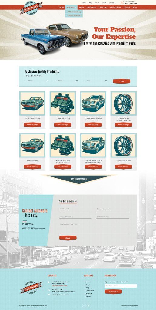
Sort of quite like it but not really loving it, trying to get a handle on what it is!
Maybe the Arizona image at the top of the page, or the Red text (Your passion our expertise) or the white box near the bottom of the page, just feel its not coherent, maybe to much going on that doesn’t blend together?
Maybe try some things like dropping (Your passion our expertise) quite happy with just; Classic & Specialist Auto Parts
Change the white box at the bottom to all blue maybe, with a white border to the contact Autoware box?
Just a bit of tuning I think
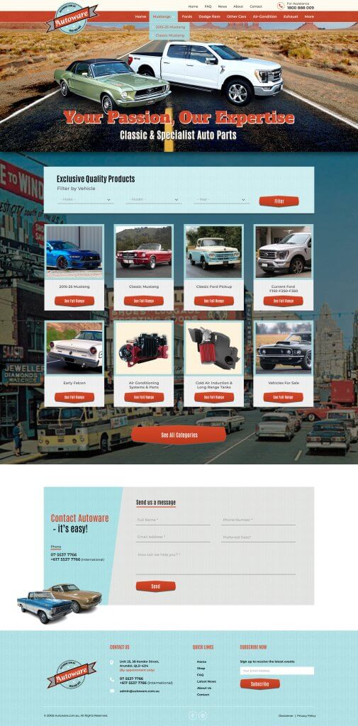
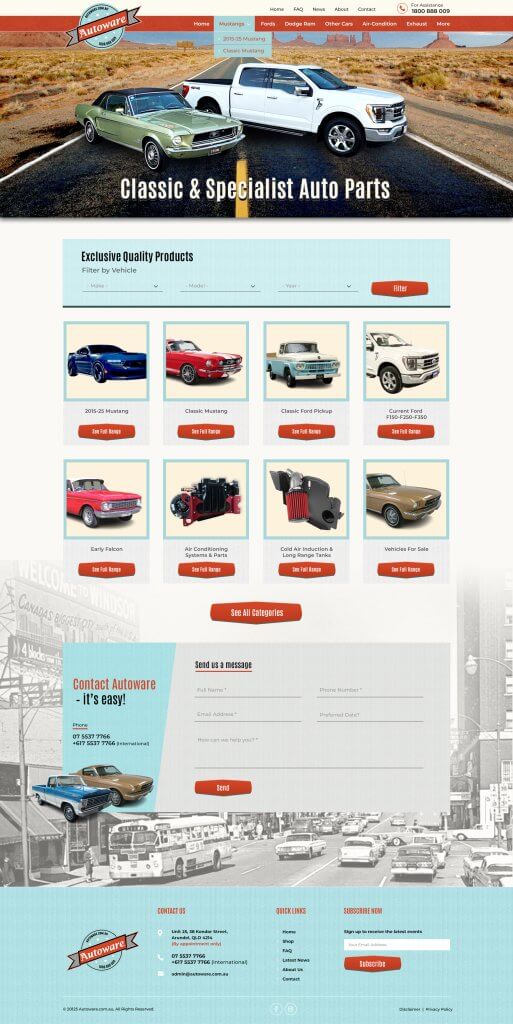
Still not sure on the design, its improved and think lower version is the better one, thinking it’s my Arizona image maybe messing it up.
I guess I want to be inspired but the look, and its not doing it!